Cream, Taupe or Black: Which Colour Survives Slush
Cream, Taupe or Black: Which Colour Survives Slush

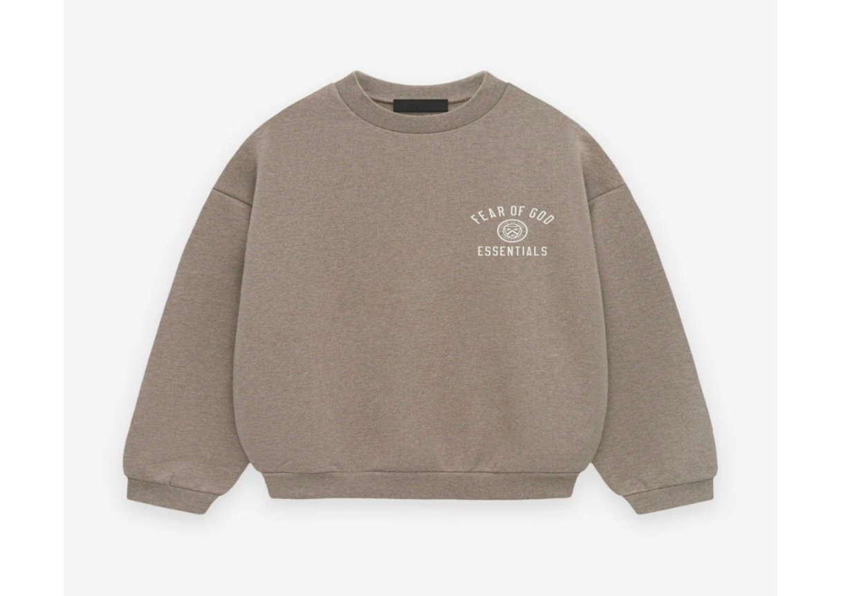
By late February the snowbank beside a Scarborough bus route isn’t really snow any more. Grey on top, brown where the tires have flung it, and a crust of salt gone chalky white along the curb. Your sleeve brushes past that every day of a Canadian winter, which is nowhere in your head at eleven at night when you’re scrolling Essential Hoodie and choosing by whichever photo happens to look good on a phone.
Winter throws two different messes at you
Road crews put down salt brine, and once it dries on fabric it leaves a chalky pale film. Traffic throws the other thing — slush that’s really grit, melted snow and whatever came off the road surface, and that lands brown-grey. Both are normal. Both happen before you’ve finished the walk from the parking lot.
So there’s no single colour that shrugs off the pair of them, which is why the question gets answered badly in most buying guides. One mess is pale. The other is dark. A fabric can hide one or the other.
Black looks clean until the salt dries
Black fleece hides dirt, no argument there, and then it turns on you the second salt dries on it. What shows up is a faint chalky edge — along the hem usually, and on whichever cuff swings nearest the car door — and from a couple of metres away it looks like the tidemark in a bath. Dry fabric, one brush, gone. Until then, it sits there all afternoon.
A cream sleeve and one crosswalk
Cream, eggshell and the paler oat shades do the opposite. Salt barely registers on them. Then a car goes through standing water beside you at a crosswalk and the splash pattern stays visible until wash day, because grit settles into the surface of a soft loop-back fleece rather than sitting on top of it. Pale fabric also shows the slow stuff — the greying at the inside of the cuffs, the shadow where a bag strap crosses the shoulder.
Which is how taupe quietly wins
Mid-tones split the difference, and nobody designed them to do it — it’s contrast math and nothing cleverer. Salt dries a shade lighter than taupe, grit lands a shade darker, and both of them end up reading as a shadow rather than a stain. Not invisible, exactly. You just have to be hunting for it from close up.
If I had to keep one winter colour, it’d be oatmeal. Honestly boring. It also means I’m not checking my sleeve at every red light.
The shades that behave this way on this shop’s pages are pretty much what you’d guess:
- Oat and oatmeal, including a lighter oatmeal pullover around the C$140 mark
- Taupe, which shows up on a pair of sweatpants at roughly C$215
- Beige, including a beige 1977 piece near C$140
- Dark grey and brown, which sit closer to black without the salt film
- Olive and sage, which go grey-green when damp rather than patchy
What’s actually sitting in the catalogue
There are 107 hoodies on this shop right now, running from about C$80 up to C$325, and black is comfortably the largest colour group. Cream exists, but it’s thinner on the ground — a cream sweatshirt near C$145, cream sweatpants around C$150. Taupe turns up once. So the practical shortlist for slush season is narrower than the colour filter makes it look.
Matched sets are where the colour decision doubles up on you, because the bottom half of an Essentials Tracksuit takes the road spray and the top half takes the salt. Twenty of them are listed between roughly C$165 and C$189, with a light grey pair sitting unusually low near C$106 and the dark grey and jet black versions at the top of that band. A darker bottom with a mid-tone top is the arrangement that survives a commute best, and plenty of the sets are sold that way already.
Black still has its winters
None of this is an argument against dark fleece. Worn under a shell on a −20 °C morning in Winnipeg, where the sleeves never see daylight, the salt question stops mattering. Same for an evening out, or anywhere you’re moving between a car and a door. And black takes one rinse and looks new again, which is more than pale cotton manages once grit is in the weave.
Light grey is the shade I’d actually argue about. It handles neither mess well. Damp patches on pale grey go almost black, they spread outward along the knit, and then they dry at different speeds, so the panel ends up blotchy. In a wet Vancouver November that is a daily event rather than an accident. And honestly, brushing the salt off dry with a cloth beats washing the thing more often, whatever colour it is.
Frequently Asked Questions
Does road salt wreck fleece or just look bad?
A bit of both, though slowly. Dried salt crystals are abrasive, so fabric worn and flexed with the crust still in it fuzzes at the cuff sooner than fabric brushed off. Knock it off while the garment is dry and the colour question goes back to being cosmetic.
Is cream a waste of money for a Canadian winter?
No, it’s just a narrower garment than it looks. Cream works for the indoor half of your week, for a car commute that doesn’t involve a bus shelter, and for March, when the sidewalks have finally rinsed themselves. Buying it as your only heavy layer is the part that goes wrong.
Which colour hides wear the longest?
Mid-tones again, though for a reason that’s got nothing to do with slush. Pilling on black turns into a pale fuzzy halo wherever the light hits it; the same wear on cream just reads as grime. Taupe, oat and brown blur both of those for a season or two longer, which is why they’re the pieces still in your rotation once the extremes have been demoted to yard work.
Should the top and bottom of a set match exactly?
They don’t have to, and in winter there’s a decent case for them not matching. Your trousers are living closer to the road than anything else you own, after all. So go a shade or two darker on the bottom half and the piece taking the worst of the spray is also the piece hiding it — nobody at the far end of the bus is auditing your tonal gradient.
Pick the colour for the sidewalk you actually walk on, not the colour that photographs best against a studio wall. Somewhere between the cream and the black, in among the oat and taupe and brown shades, is the piece you’ll still be reaching for in March — and that’s worth two minutes of scrolling before you decide.